

Anti-Violence Alliance
Design Project Center
Senior project
Fall 2019 & Spring 2020
Matt Medonis
Maddy Martin
Melony Federspiel
Problems : The Anti-Violence Alliance, previously known as the Anti-Violence Coalition, had no visual identity and had no way to currently promote themselves on campus.
Solutions : As a team, our solution was to first design an identity for the brand, and to furthermore promote the Alliance to the rest of Campus. We were also tasked to create a marketing campaign…
 Logos : Our logo is meant to symbolize strength. We chose a bold, yet classic illustration to represent the AVA’s stance against sexual violence. Three versions of the logo are available depending on the size is needed for advertising purposes.
  Colors : A color palette should represent the brand. Therefore, we chose blue tones as they are often associated with depth and stability and symbolize trust, loyalty, wisdom, and confidence. Neutral gray tones were used to accent or compliment blue tones.
 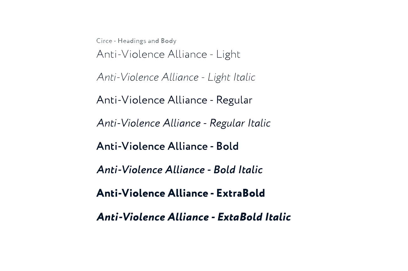 Type : The Circe font used is a geometric sans-serif with some humanist features and is available is six weights from thin to extra bold and stands out in all its forms. While this typeface is both easy and pleasing to the eye, it keeps with the message of strength communicated in the logo.
 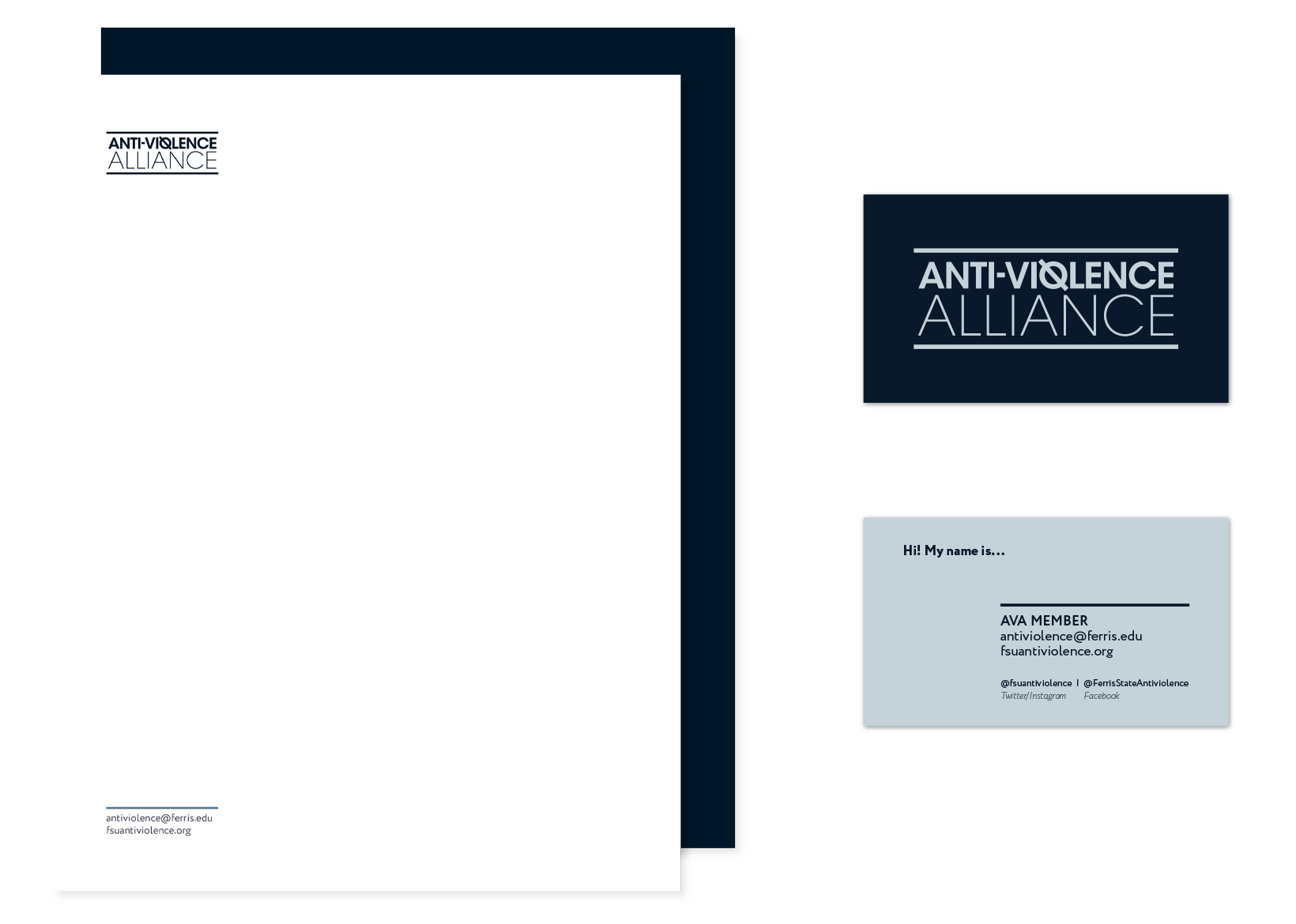 Stationery : In order to communicate the message of the AVA, we offer members three options: Letterhead, #10 envelope and business card. Each form of communication is designed to be personalized by the member. Through this personalization, the recipient can easily identify and connect with the member.
 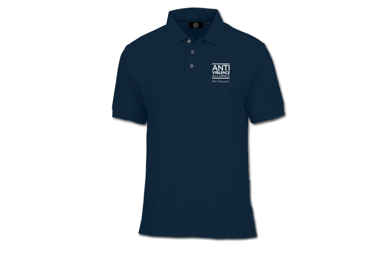 Polo
Polo 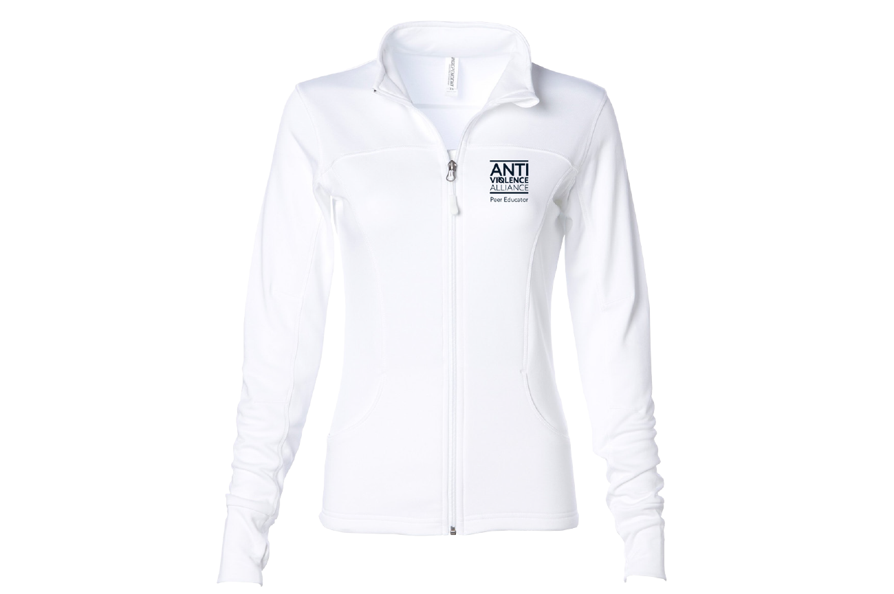 Jacket
  Quarter Zip
 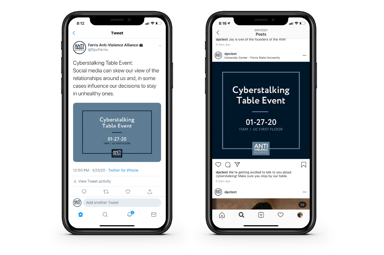 Social Media : Social Media is a fundamental part of promoting events in today’s world. When posting on social media, the message should be short and simple with a call to action. We offer several options to communicate the AVA’s upcoming events.
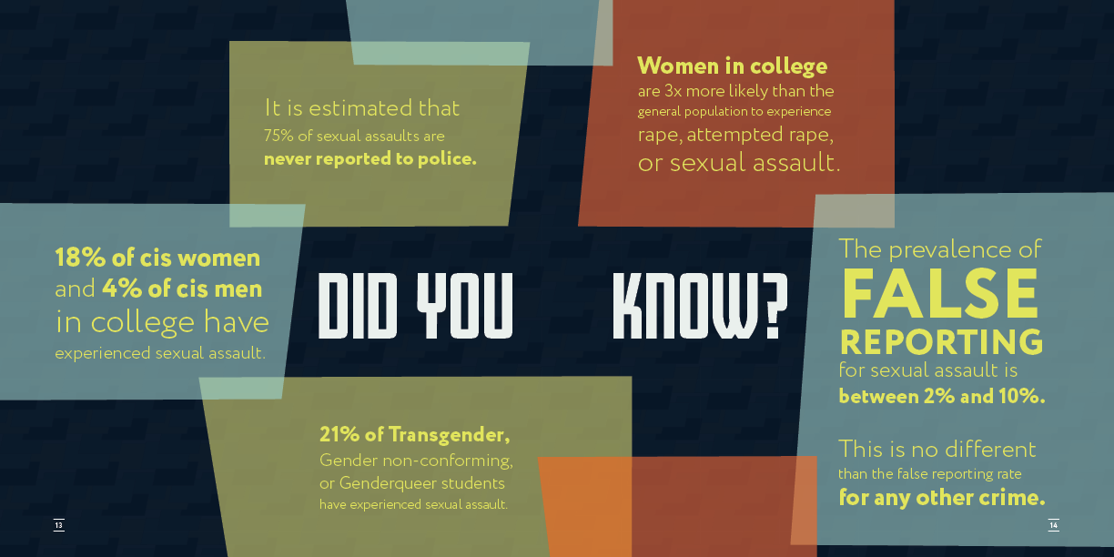
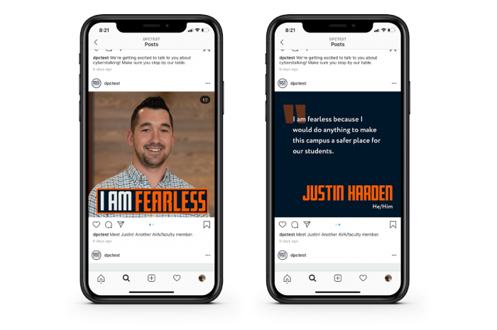
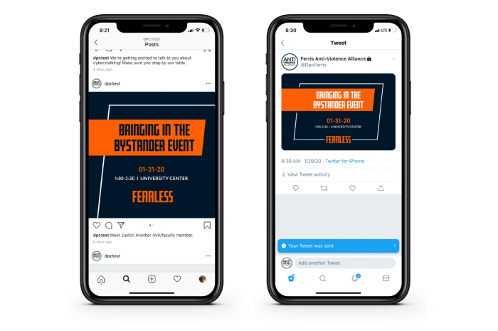
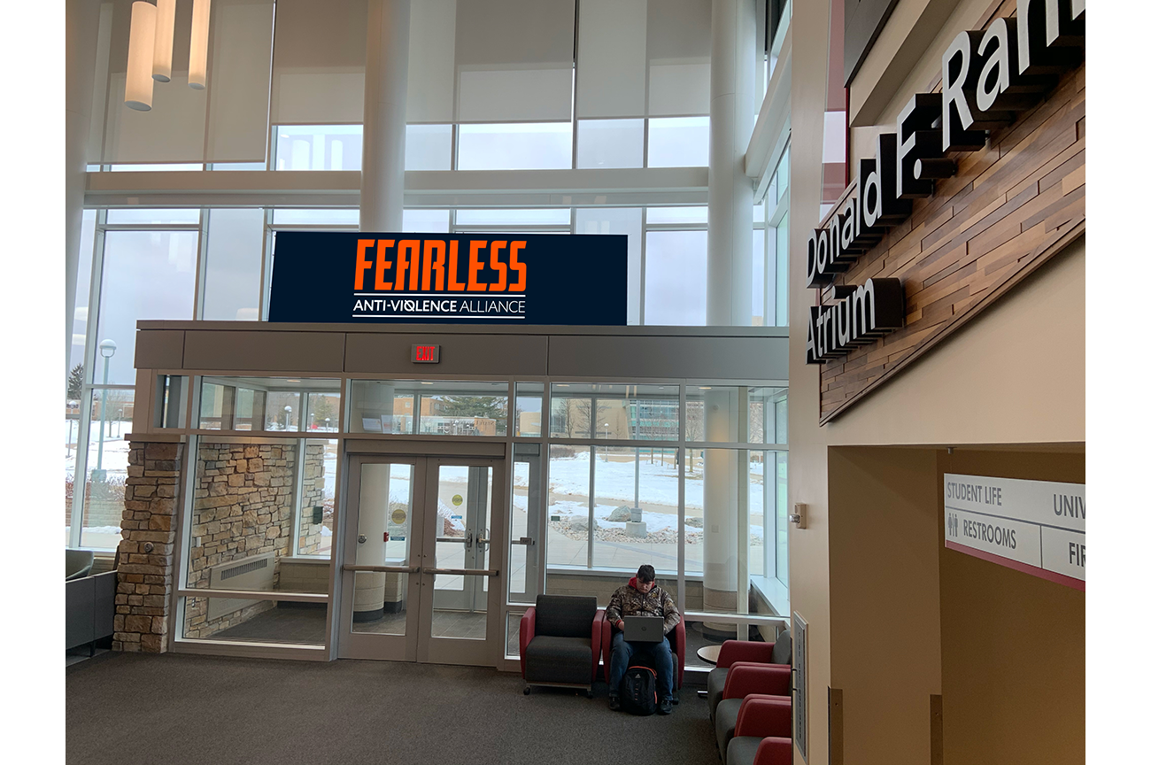
 Fearless Campaign
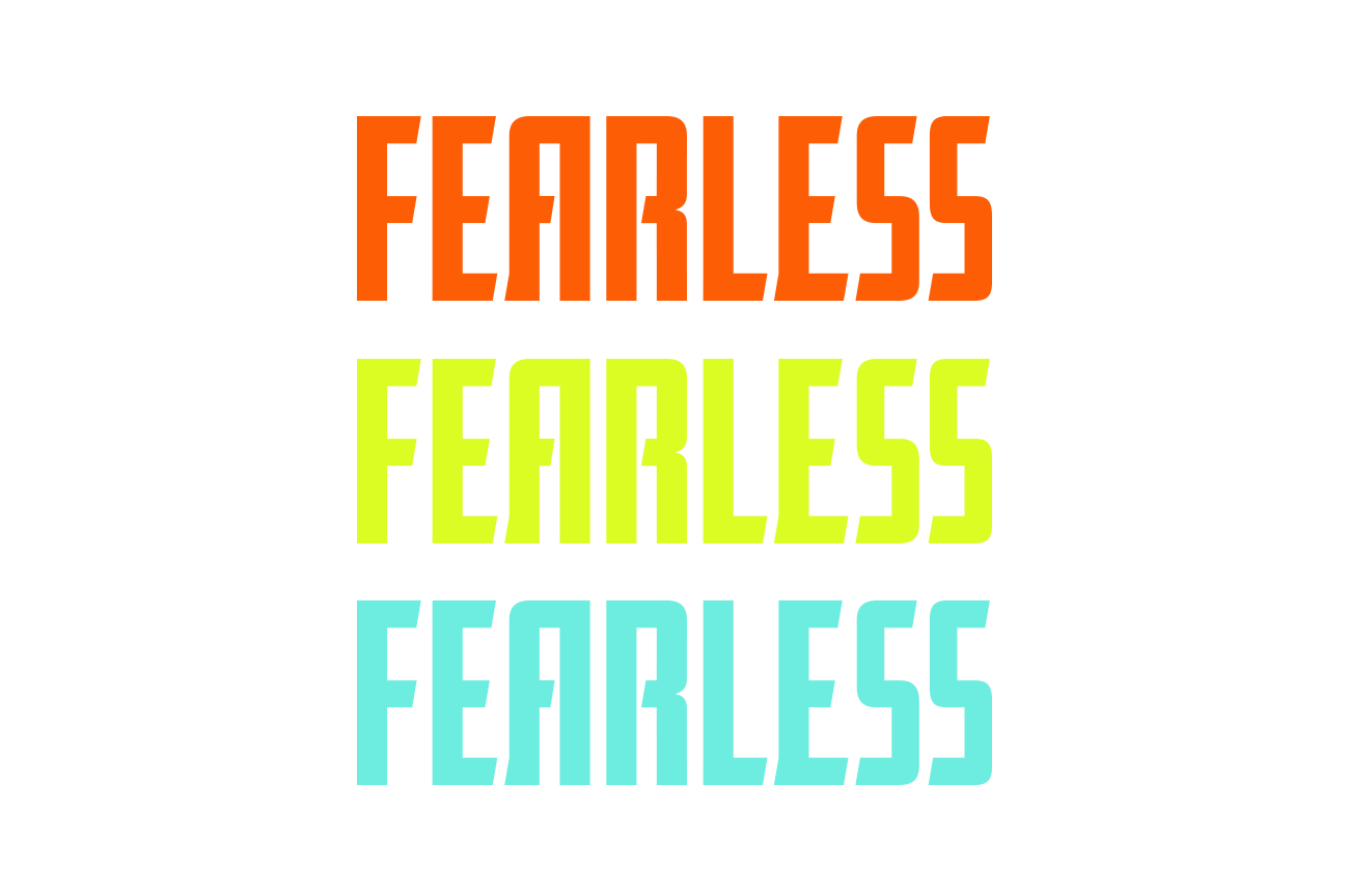 Logos : Our logo is meant to stand out and be noticed. We chose this version as it boldly communicates the message that is represented by the AVA.
 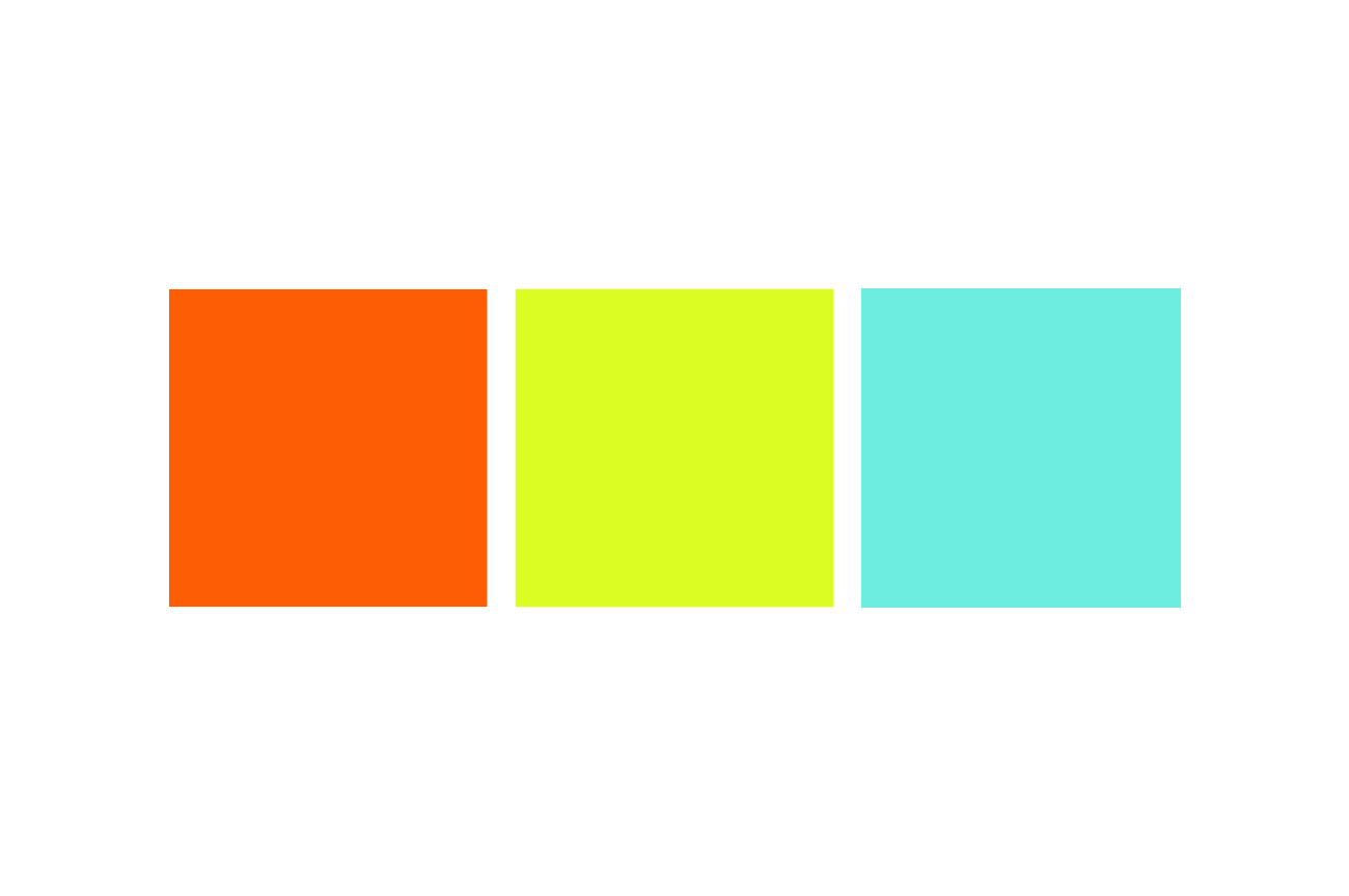 Colors : A bright color palette commands attention due to their hue and brightness. We chose these bright colors as they stand out and draw a reaction to the words they represent.
 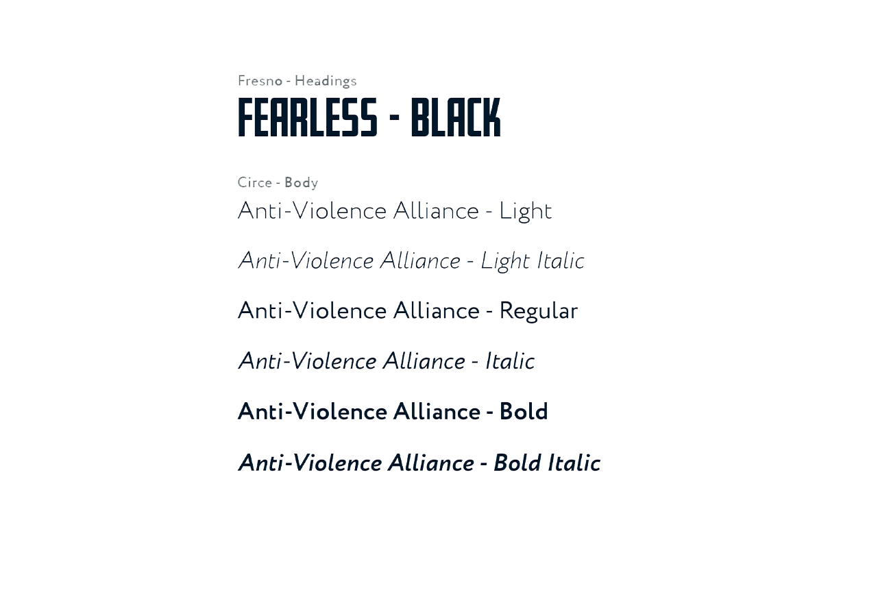 Type : We chose the Fresno font for the Fearless Campaign. This font is bold and pairs well with the colors used in the logo. It gets notice and will catch the attention of the reader.
 Social Media : We chose the Fresno font for the Fearless Campaign. This font is bold and pairs well with the colors used in the logo. It gets notice and will catch the attention of the reader.
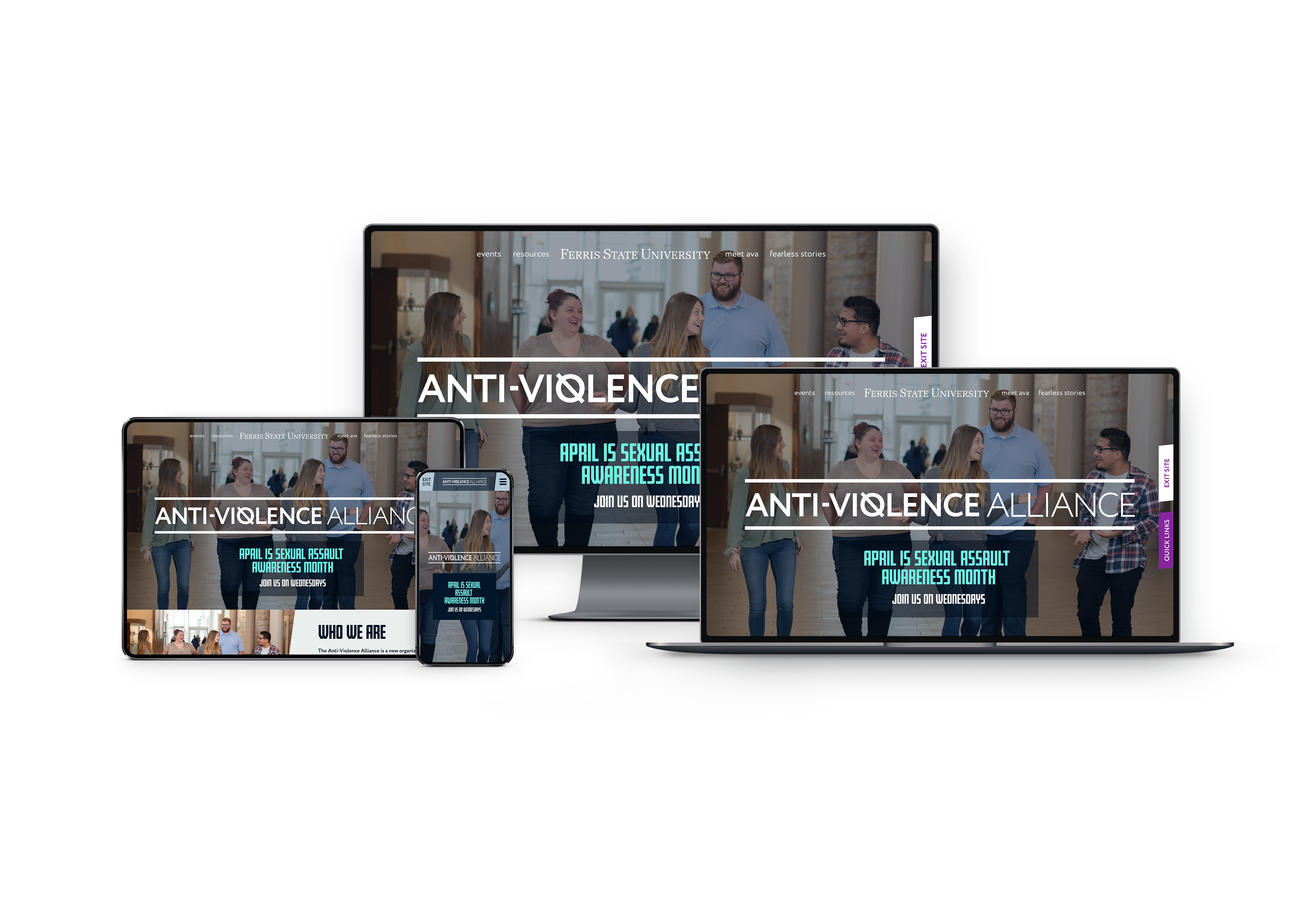 Responsive Website : Our website is a responsive website as it is imperative that the content and message relayed in the AVA website meets the needs of all its users. Whether using a mobile device, personal computer or a tablet, the message is clear and concise.
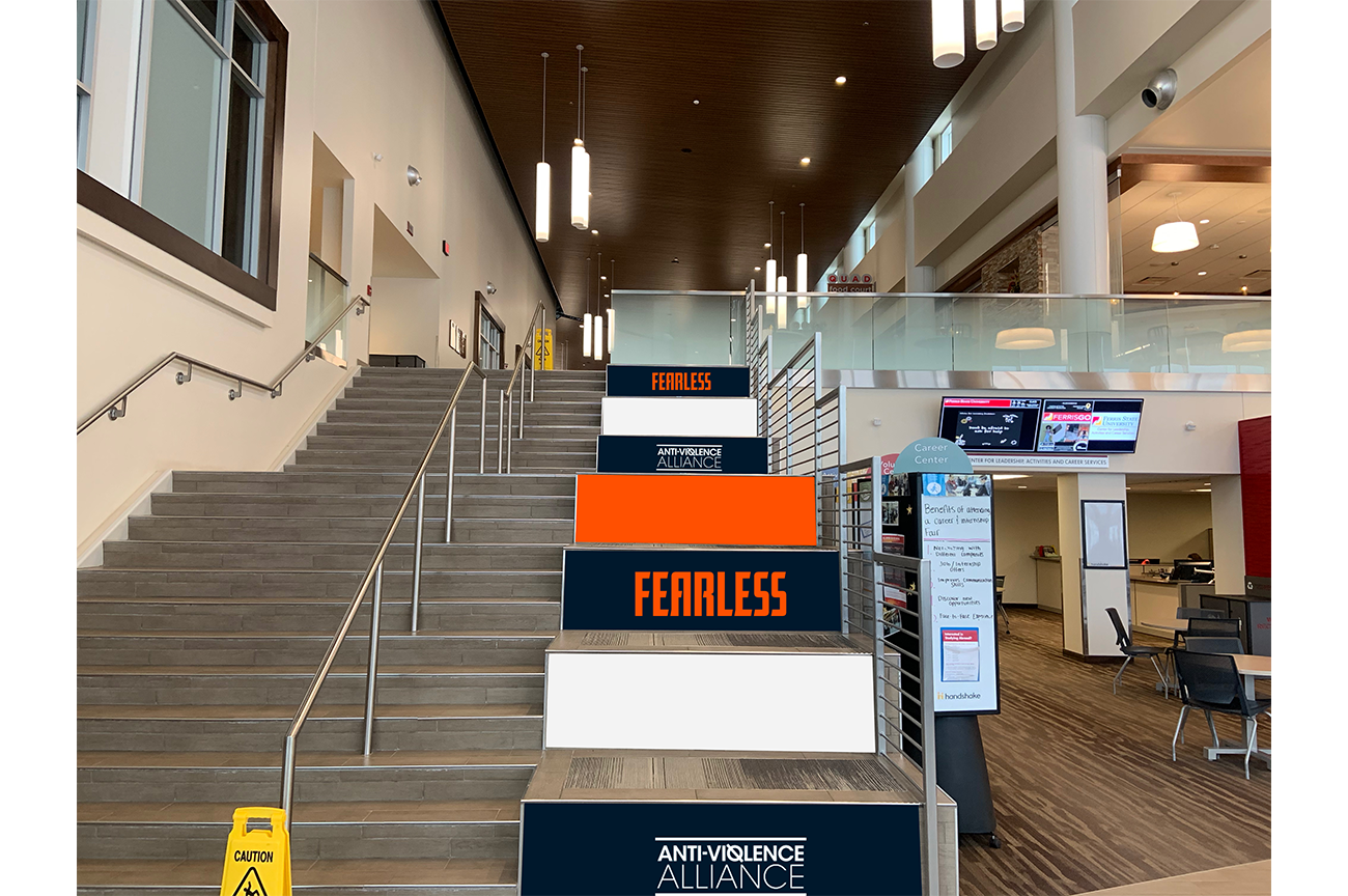
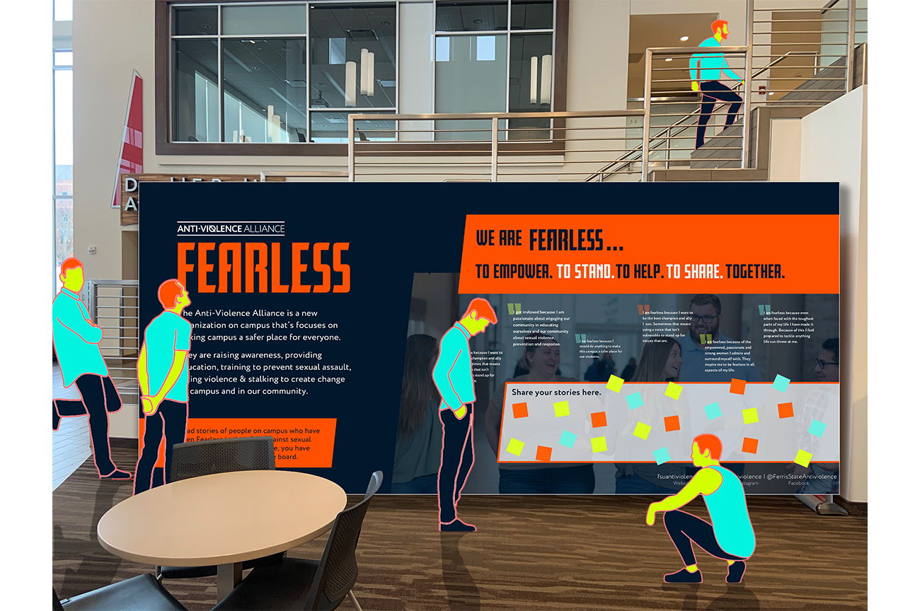
Interactive Installment : The Fearless Stories interactive portion of the website was created for the University Center’s use during the month of April which is Sexual Assault Awareness Month. Its intent is to bring more awareness to the community through personal stories shared by both students and faculty members.