The Print Lab
Junior project
Summer 2017
Designer: Kyle Rice
The clients initial request was for a logo, but based on some of the user complaints, it was clear that there was a larger brand issue that needed to be solved. The objective was to create a design system that not only solves the client request, but also solves issues on a user end. The system would cater to the functionality of the program and display the core teachings of Graphic Media Management.

BEST PRACTICES: CATERING TO THE MAJORITY
Because the majority of the daily users are students it is important that they are drawn to the space. However, it is also important to recognize that this is still a business, and branding must be considered professional (especially since there is a demographic of older individuals that also use the space). Incorporating darker elements into the brand up its level of sophistication and professionalism, but having pieces of color creates a unique blend of youthfulness.
THE PROCESS
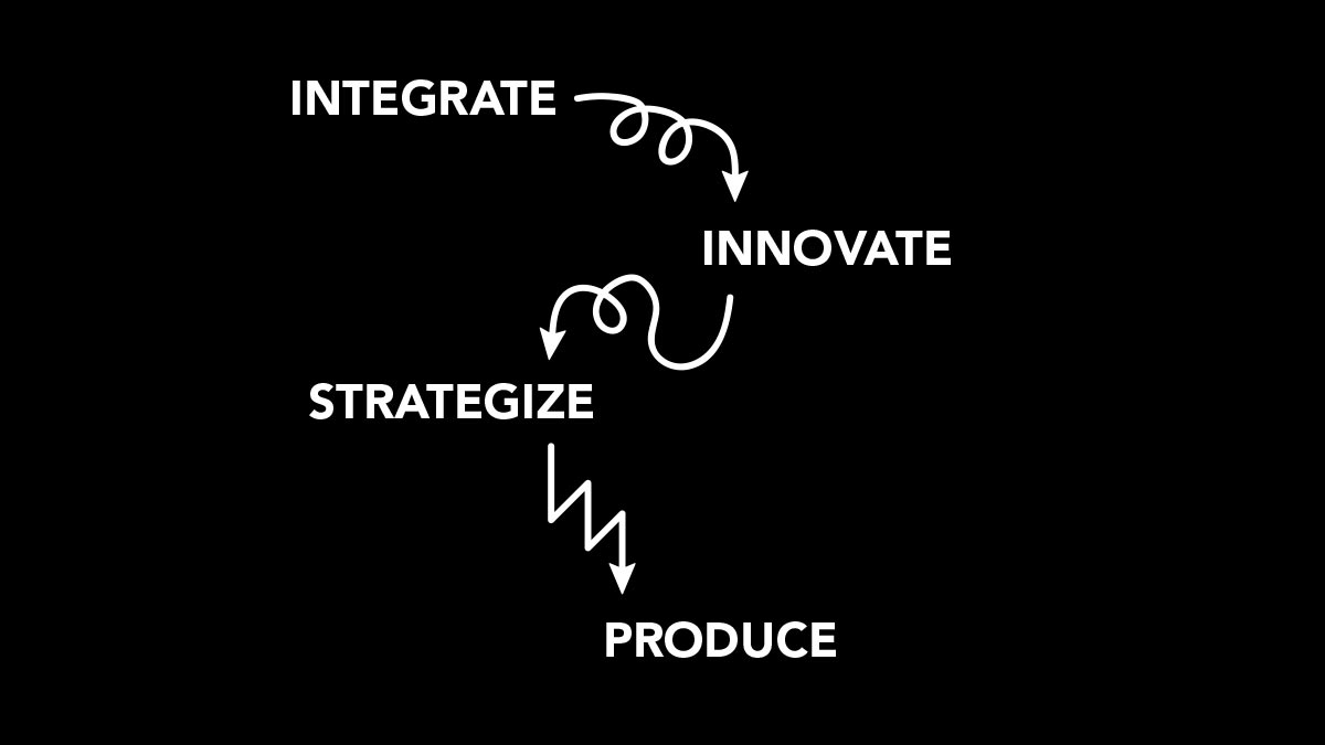
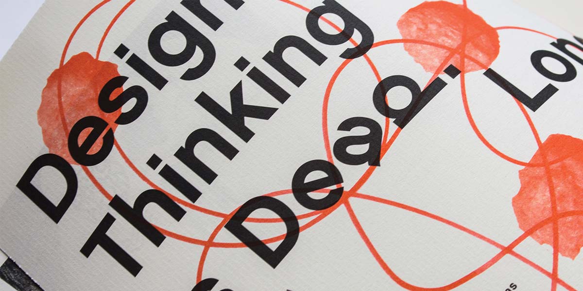
The first thing that was asked from the client was to provide assets that would explain what Graphic Media Management was to someone who has never heard of it before. His response was this: integrate, innovate, strategize, produce. This was the process to which user problems were solved. Much like the design process, this led students to develop a sense productivity the print: how was a client request going to be done, what is the best method of operating, how will this better the printed piece for the client, and finally the production of that piece.
DIRECTIONAL ARROWS
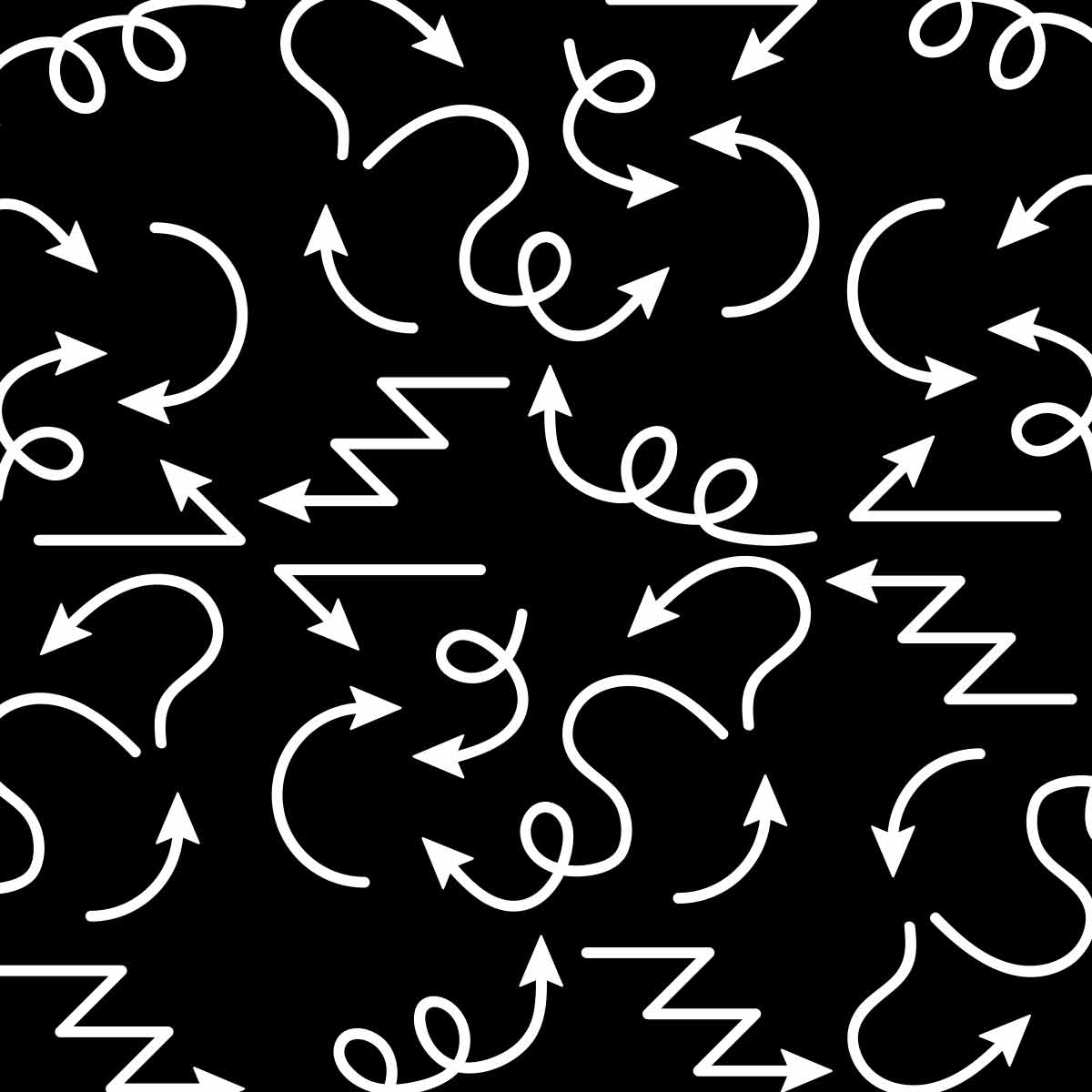
Part of the process was finding a piece that was not only conceptual, but was also functional for multiple different purposes. The arrows symbolize the crazy nature of the process as well as the business of a print shop. The arrows are also used to direct attention, both in the space and on printed material. Continuous work is still being done with the client to solidify space navigation.
LOGO
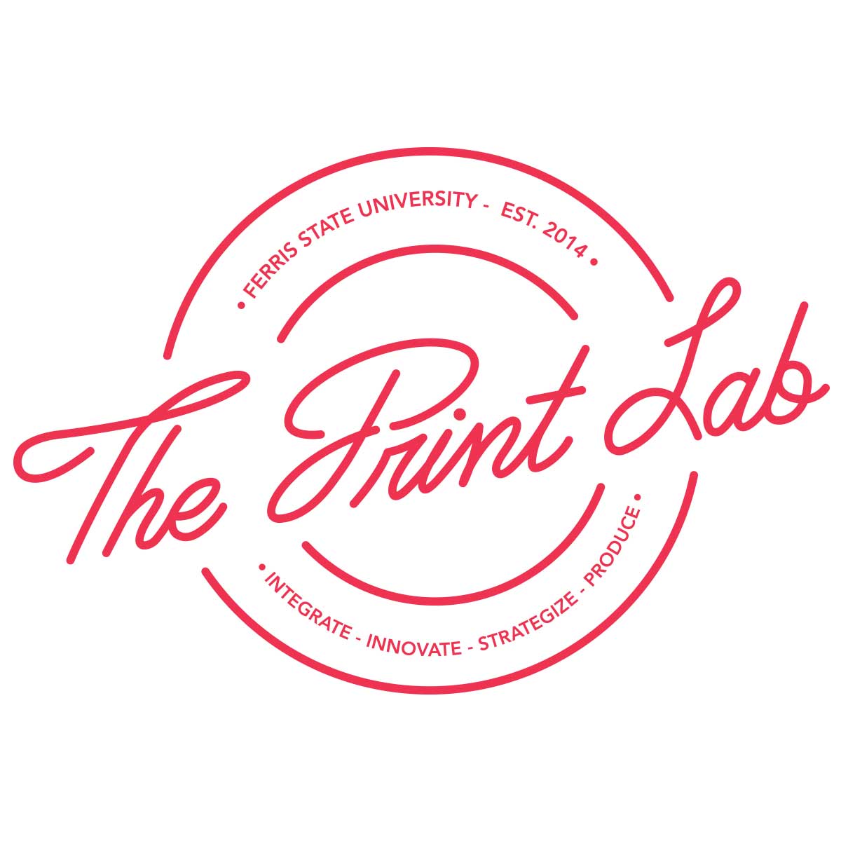
The rings around the word mark are a visual symbol for the rollers within printers that aid in the transfer of printed ideas.

SKETCHES
The new logo features clean, consistent lines with a nudge towards logo work from the 50s. Print, although adapted to technology, has a rich history, so incorporating vintage design inspiration was key in its creation. Color and type were chosen based on the current Ferris brand standards. The font that circles around the logo name is Avenir, to remain consistent with Ferris Standards, while the font in the center was hand created so the new owner has copyrights to it.
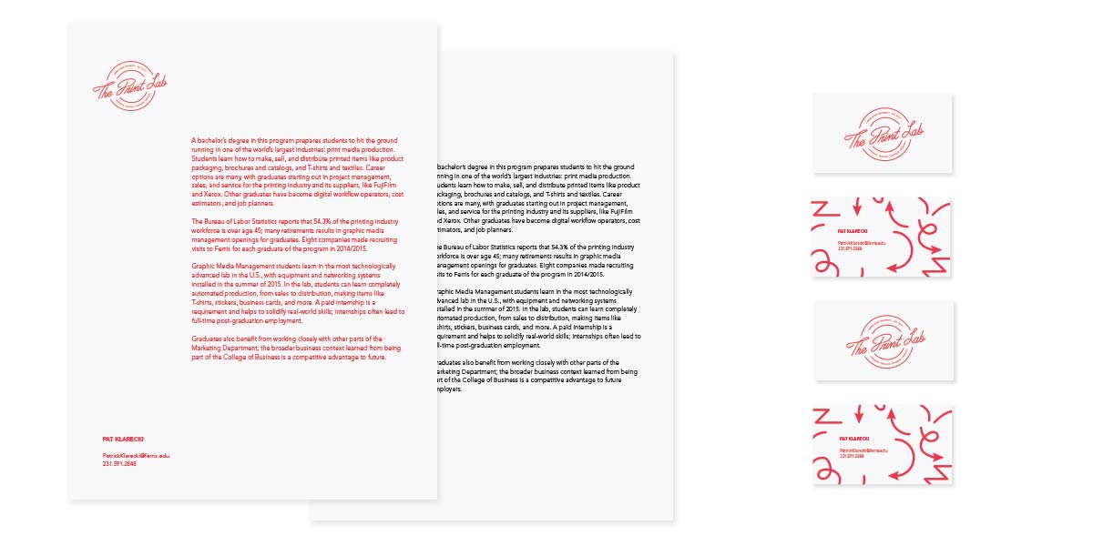
BUSINESS SYSTEM
Although not extremely complex, this touchpoint is very important to the client because the program is fairly new and growing at a rapid rate. The first touchpoint that a client saw would need to be professional, sophisticated yet remember able, so printing with red uv inks was with a minimal design was perfect.
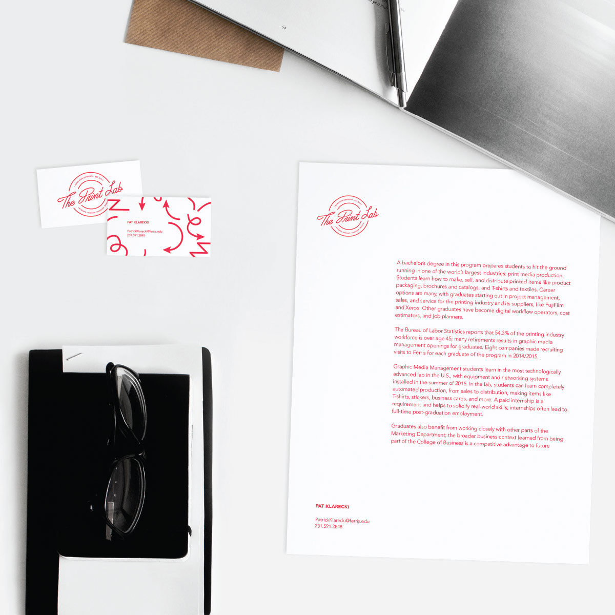
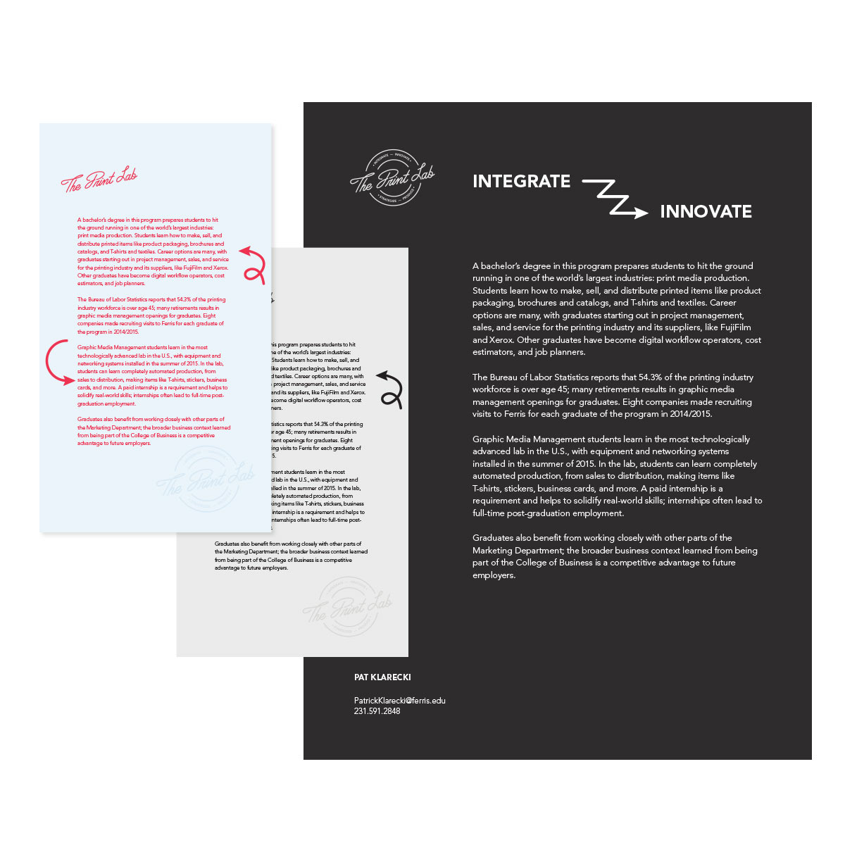
PRINTED SAMPLES
Additional printed pieces were designed to not only educate individuals about the Graphic Media Management program, but also showcase some of the unique paper options they have as well as different print methods.

STAFF SHIRTS
This touchpoint helps new and returning clients quickly identify which worker is best suited for their needs. This helps to cut down some of the complaints that derived from the user interviews.

