

Waffle House Brand Disaster
Junior project
Fall 2018
Matt Medonis
Waffle House serves great breakfast food 24/7. Although they have some key factors that are bringing them down.
Problems
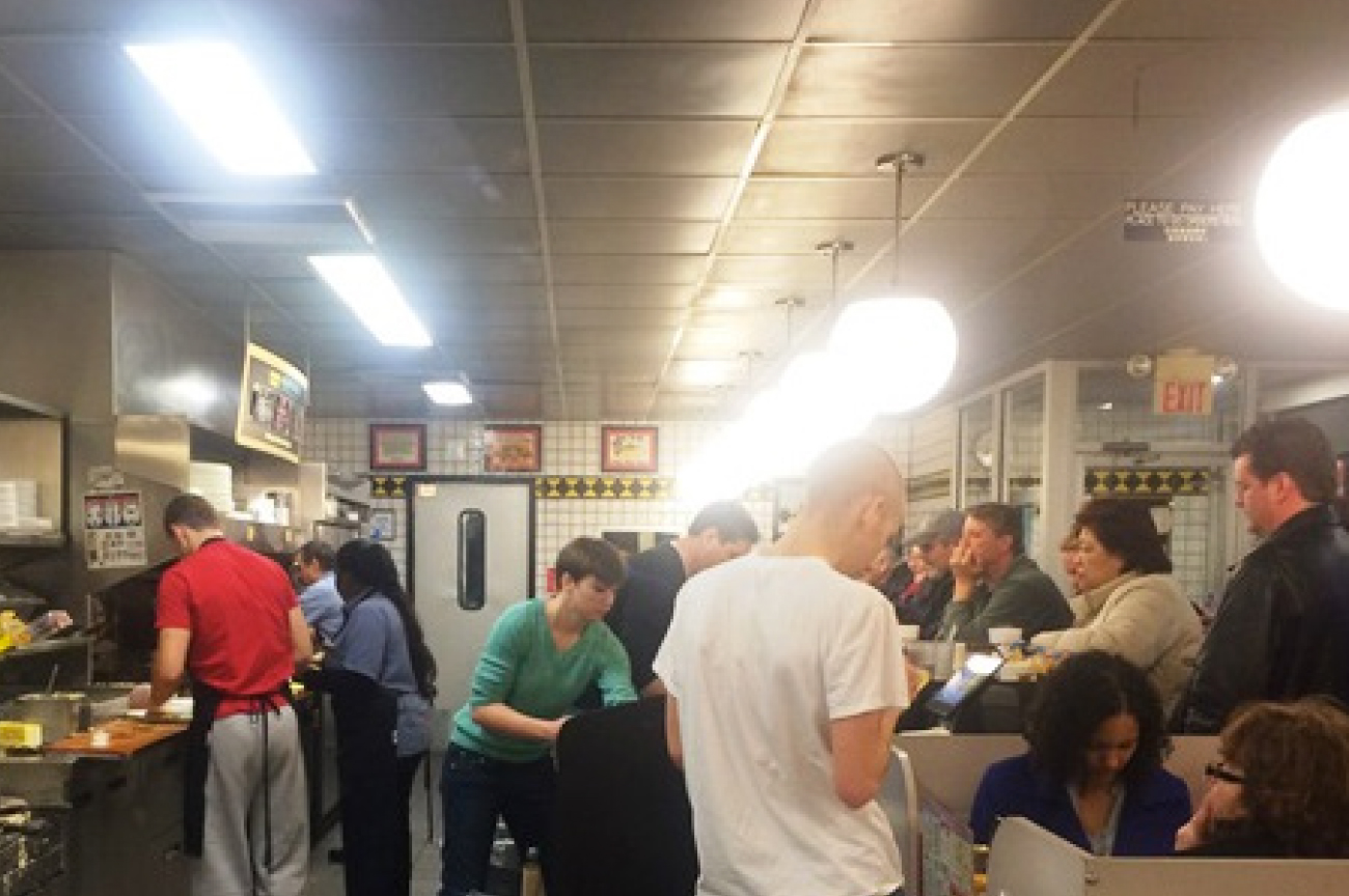 Current Place to Pay : The skinny walkway gives no room for customers while paying and waitresses trying to get food out. This can be very stressful trying to pay and get out of a Waffle House in a reasonable amount of time.
 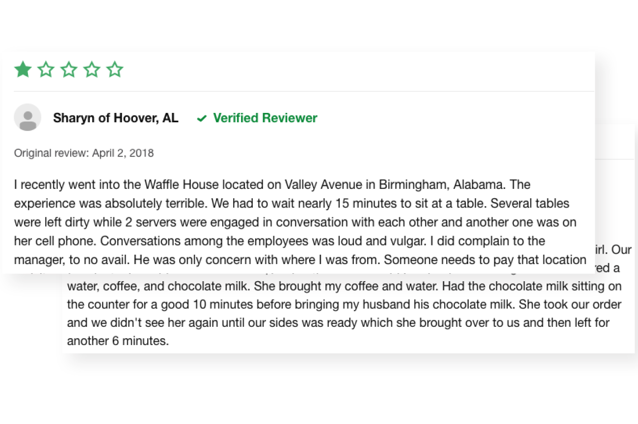 Service : Waiters and waitresses often times do not care about their job or their customers. Often times they will be more occupied on a conversation with another employee rather than the job itself. Over half the complaints online are strictly about bad service from waiters/waitresses.
 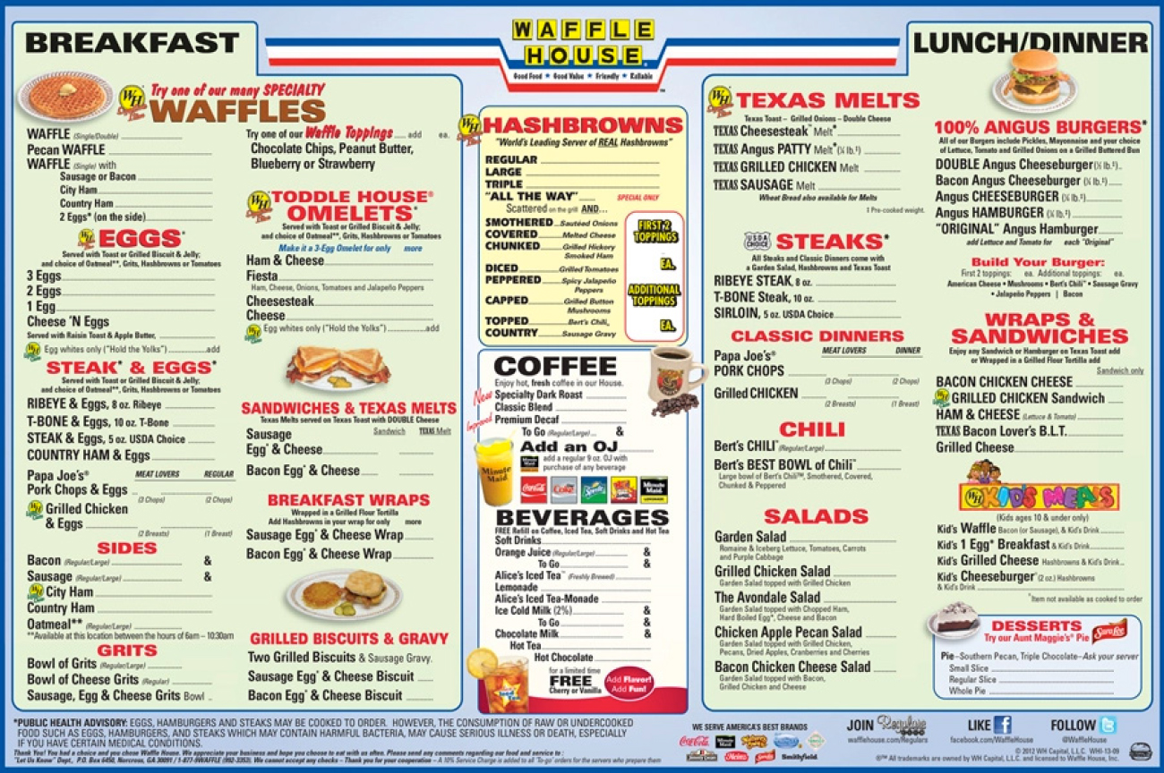 Menus : They are not very memorable and old. The menus are hard to understand.Vernacular is hard to keep up with because it is not fully stated on the menu.
 Best Practices
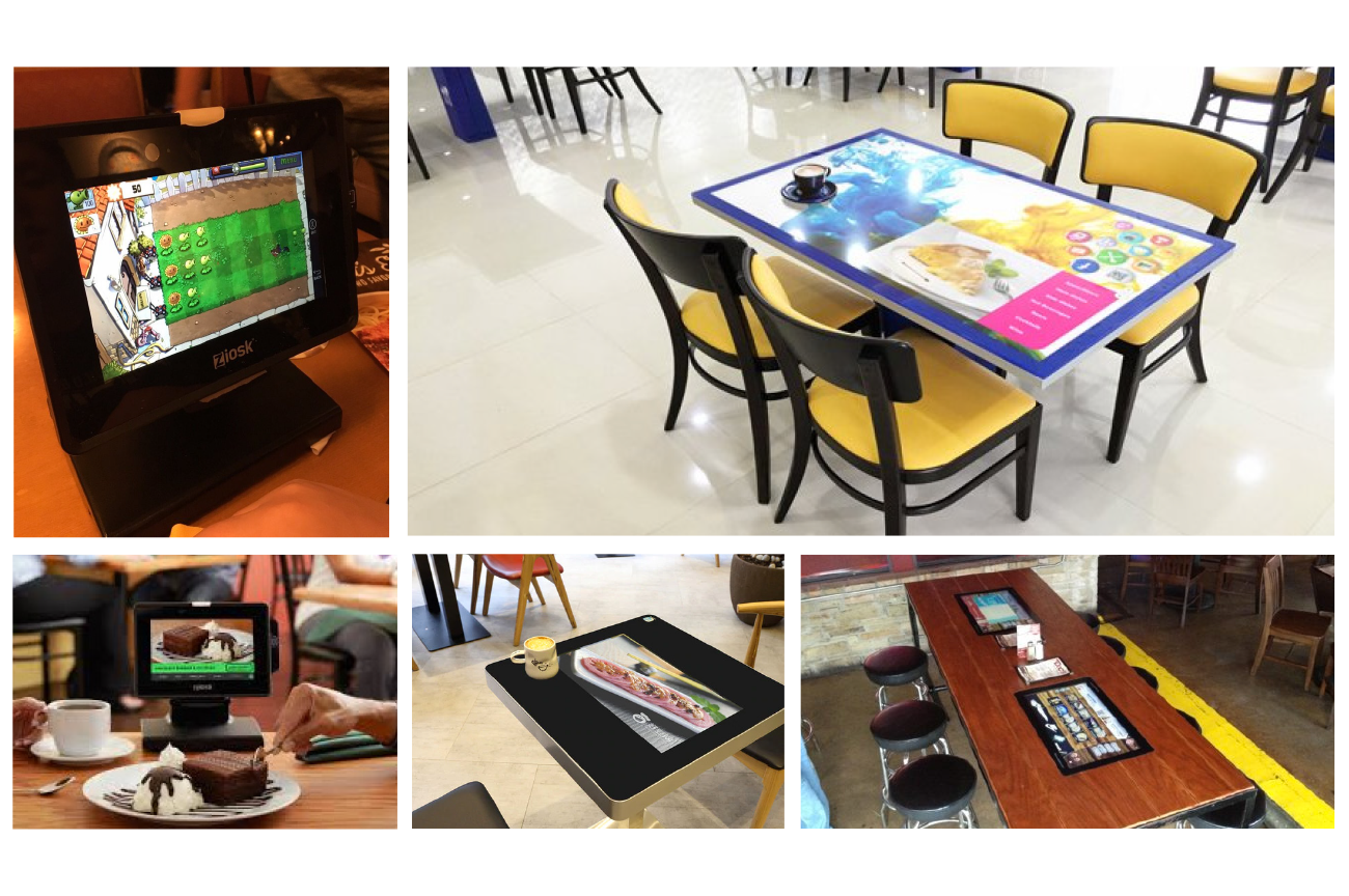 I quickly figured out that I wanted to redesign the menu digitally, and found some best practices.
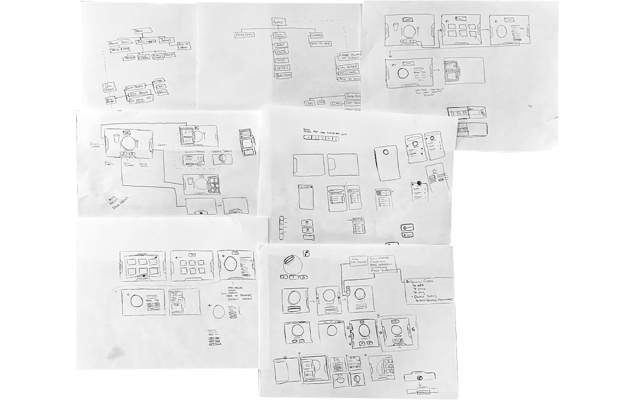
 Sketches
New Digital Menu
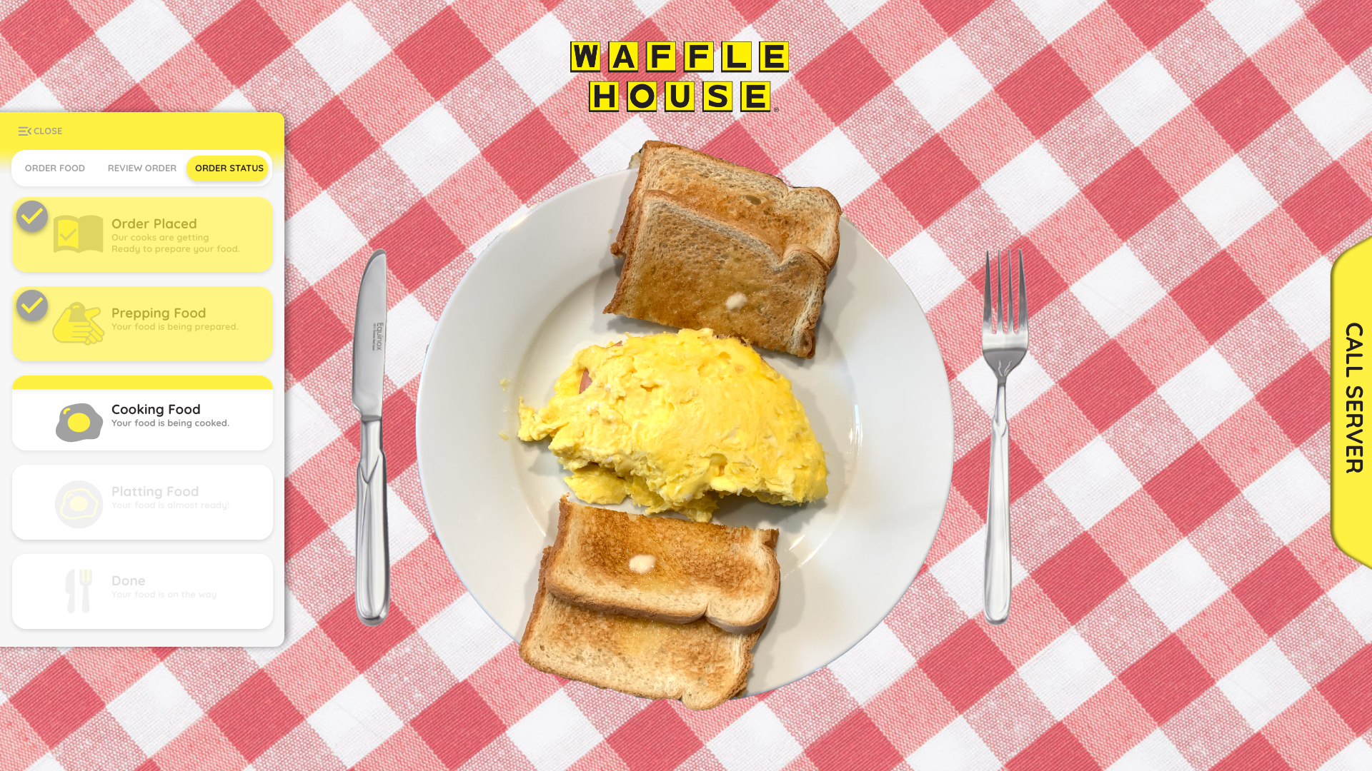
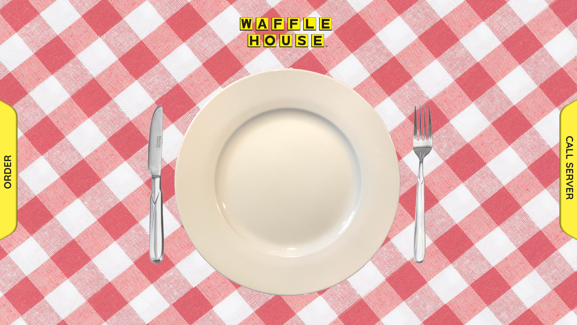 My approach was to make the menu feel real. Very little UI is involved on the main screen and all you see is the empty plate.
 Key Features


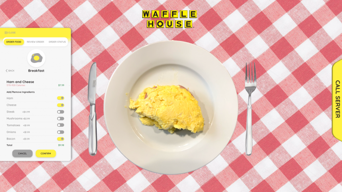
This registration black and yellow is very hard to work with so I added a neutral grey and designed my own icons inside of Adobe Illustrator
Screens Continued

Solutions
Space, Service, Menus : This digital menu alone solves all three problems I stated at the beginning. It made the menu more memorable, it makes the service better, especially with the call button always on screen, and it causes less traffic in the front of the store as you can now pay straight from your table.